
![]()
[hr color=”white” width=”50px” border_width=”1 px”]
![]()
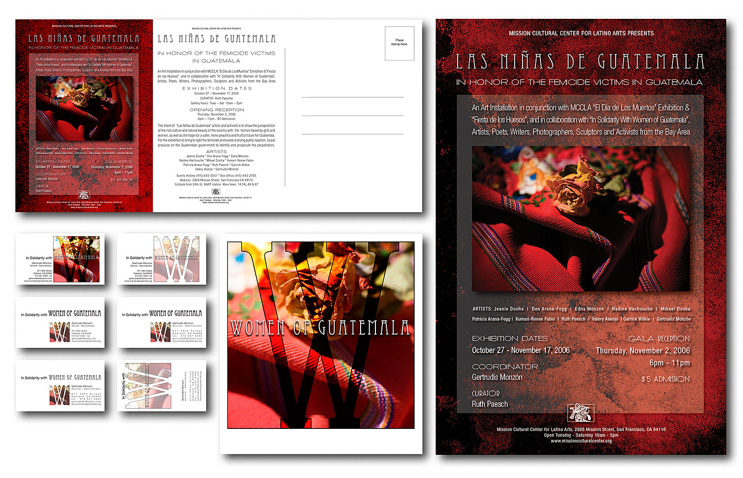
Above is what I delivered. We’ll look at the files that created all of these in class, in detail. Note these aren’t to scale here. They’re simply arranged and scaled to fit in this graphic. The poster is 18 inches tall and the mailer is standard mailer size. The teaser is about the size of an LP cover (man do I miss those days!) (click it for a larger image)
The Process Continues :: Idea Development before Production
![]()
I wanted to share the deliverables, the final project, with all of you in the class first, so the rest of the process would make more sense. Now that you can see what I designed, I can explain what steps it took to get the imagery to feel right. It all started with a lot of listening, research, emotion and feeling.
[col grid=”3-1 first”]
Introspection / free thinking
[/col]
[col grid=”3-2″]
The research I’d done took days and days of solid, focused time. I’d read MS Word docs sent to me by various agencies and my client, and also attended a public outreach conference the group was participating in locally. I’d seen many websites with more detail than I could stomach. Since the event was going to be in The Mission District of San Francisco and in association with an art installation it was important to stay faithful to the content, which was brutal and depressing, while also creating positive energy so visitors wouldn’t be repulsed, but rather, would want to participate and help! I didn’t want my designs to push visitors away. Immediately the colors and emotions of the world famous Murals in and around The Mission came to mind. I wrote my own feelings, thoughts, ideas, visions and concepts down sort of like a rough journal so I wouldn’t forget them.
[/col]
[hr color=”white” width=”50px” border_width=”1 px”]
Next, I categorized and organized my discoveries to help focus ::
![]()
[col grid=”3-1 first”]
Red theme
[/col]
[col grid=”3-2″]
Signifies blood, passion, is a central color you see over and over again in Guatemalan Art and especially in the indigenous people’s clothing and designs. Since much of the femicide is racially biased that’s a powerful overlap … blood and ancient Mayan colors.
[/col]
[col grid=”3-1 first”]
Dead Rose
[/col]
[col grid=”3-2″]
Kept seeing it. There are many, many bright flowers in Guatemalan designs so a dead one grabbed me. Dead flowers on graves, on crosses by the sides of highways etc.. Yes, it’s a little cliché here in the states (USA) but it’s easily understood by the target market.
[/col]
[col grid=”3-1 first”]
Indigenous huipile, top women’s clothing
[/col]
[col grid=”3-2″]
Another very common sight in Guatemala. Something everyone knows and associates with native, Mayan, women and girls. They’re gorgeous works of art and are collectibles. They have flowers embroidered on them by hand. Perfect place for a rose … near an embroidered one. (even if the viewer doesn’t make the connection … it’s felt).
[/col]
[col grid=”3-1 first”]
Grit, Stone, Dirt, Roughness, Darkness and Light
[/col]
[col grid=”3-2″]
Lots of shallow graves, the brutal deaths and subsequent disappearance of family members, back to earth and dust. This could grab visitors if I did it right.
[/col]
[col grid=”3-1 first”]
Latin design is busy, lots of type
[/col]
[col grid=”3-2″]
My own sensibilities are the opposite. I like clean, open negative space but that wouldn’t work. Think of all the writing on ruins. Think of all the pictographs. Nowadays murals are everywhere in Latin America and we’re blessed with some gorgeous ones in The Mission District.
[/col]
![]()
[hr color=”white” width=”50px” border_width=”1 px”]
![]()