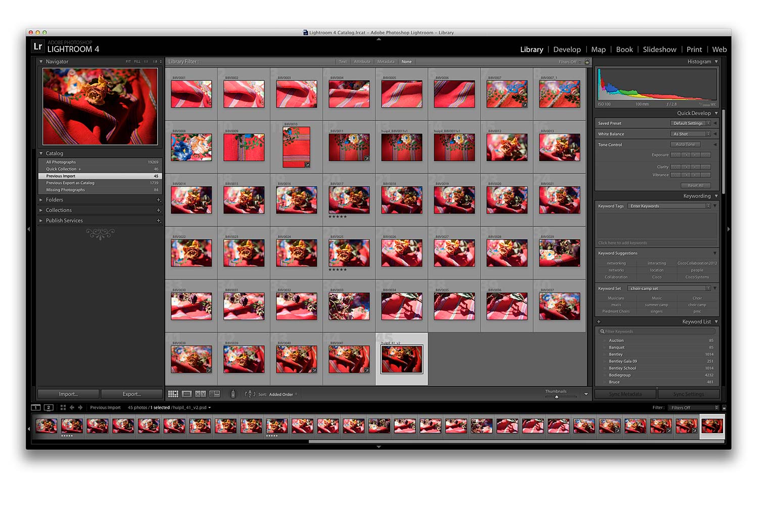
That’s the first photo session as it looked, RAW files imported into Adobe Lightroom. (click it for a larger image)
[hr color=”white” width=”50px” border_width=”1 px”]
The Process Continues :: Production
![]()
After creating the master InDesign documents for the large vertical poster, the mailer, smaller poster and teaser image, I started creating images. I knew the campaign would really hang on a central image or theme. I shot various compositions of an antique huipile with the constant awareness it would become a theme image for the campaign and also a central design element I’d pickup on depending which principal I was employing. I selected a few images and then refined my choice.
![]()
[col grid=”3-1 first”]
Decision :: anchor upon this image
[/col]
[col grid=”3-2″]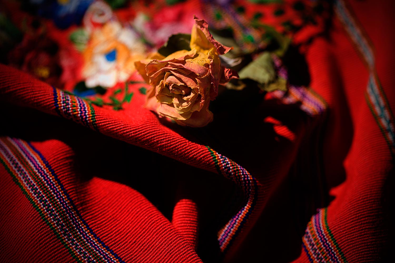
[/col]
![]()
![]()
[col grid=”3-1 first”]
Lightroom, InDesign, Illustrator, Photoshop and exploring type libraries
[/col]
[col grid=”3-2″]
Starting in Adobe Lightroom I optimized the RAW capture, color balanced the image and exported it over to Photoshop. Once in Photoshop I started to play around with various layer options just to get a feel for what the image might allow. I was keeping all my options open. I’d started to work using Adobe InDesign … blocking out general areas for type and playing with placingthe image into either a background or in a central area. I used Adobe Illustrator to experiment with type. I didn’t have the type I wanted to purchased two new fonts online and downloaded them. Then, back in Photoshop, I started to see how a huge “W” could really look great.
[/col]
![]()
[col grid=”3-1 first”]
Here’s how it looked in Photoshop
[/col][col grid=”3-2″]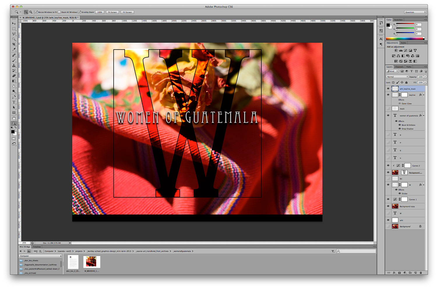
[/col]
![]()
[hr color=”white” width=”50px” border_width=”1 px”]
![]()
When you enlarge the screen grab above and check it out really large (click on the image) you’ll be able to see various layers turned on and off and the different experiments with Type all turned off. There’s a white mask layer that blocks out all of the background outside of the black keyline that is off in this screen grab so you can see the entire photo and how I approached it. I keep ALL of my tests in case I change my mind later. We’ll go through this image in class during one of our hands on sessions.
I’m very happy with the decision to open up the left top of the large “W” to create a visual flow around the entire frame. I forced tangents to create tension and then opened up the top to create entrance and a release at the same time. I never really studied this formally in design class but I did study it formally in fine art classes in drawing and painting. Mostly I studied it in MUSIC!!! So, I carry over a lot of my old school, more traditional / classical training into my current work and I cross polinate the differrent artistic skillsets I learn along the way. I’ve found that most of my clients don’t want to know all the little details and don’t understand what amount of work has gone into tiny things that, to me, make a huge difference but, I do them anyway so I feel complete and can be happy with the work I create. That’s a huge balance to play with when you’re in business for money, on tight deadlines and often times working with folks who just don’t care. I get excited and like to chit chat and some folks just want their work and don’t care how it got there. I’m lucky … I love the work so if the client doesn’t give me feedback I’m OK. This is enormous and perhaps why I’m still in business after all these years. (yep, top of the “W” in each project).In this specific case my client cared a lot and saw the little details immediately. It turns out she also has a formal art background. It’s great when your efforts are noticed. We had lots of fun talking about what other nuances I was imagining.
[for example :: There’s also a fun double entendre happening there, at the top of that “W”. In Navajo weaving, in their “NOT FOR THE TRADE” work, for themselves and not public, there’s a concept that’s very important. The devil was believed to be contained within enclosed design elements so the traditional weavers would add some little stitches at the corner to break the margin. Just like the white key line above, at first they look like mistakes but they’re far from it. There’s no contained space that way. It works for them! I love this sort of fun stuff!]
So, the type is EXACTLY where I want it. I noodle or Ouija Board various elements, in this case type, until it just feels right. This means the composition, proportion, scale, balance, harmony, contrast, juxtaposition (for my fun with tension and release) etc. are all working together to create unity. There is no right answer and that’s one of the greatest things about design. Every person creates their own way so all approaches have value. Some clients like my approach and others don’t understand what I’m up to sometimes. I don’t push it on them but listen and adapt. If I can get my ideas through that’s a real bonus!
![]()
[hr color=”white” width=”50px” border_width=”1 px”]
![]()